Thursday, June 6, 2013

Half Moon + Polka Dots

Another one of those looks that was better in my head than in real life. I'm currently working my way through my polish rack, trying to give some love to many polishes which haven't been used in a LONG time. This brown is actually a franken I made before I knew that anyone else did that sort of thing.

Long side note: Six weeks after my 4th baby was born, fibromyalgia descended like a load of bricks out of a dump truck. Among the many ways I have tried to deal with it was a long phase of treatment from this book. It didn't work for me, but during that phase I bought some sal-free cosmetics here. I ended up dumping some coppery brown loose mineral eyeshadow into a polish I didn't like, and tada! I never even named it...maybe I'll go back and do that!

So, it being late spring, I wasn't really excited about going into my brown stash. I thought pink (Sinful Colors Pink Forever here) would be a good pairing, and it might have been with a shade a bit lighter. But I was going for something that wouldn't require a gazillion coats over the brown, or laying it down first and then carefully painting in the half moons as I saw one blogger recommend. I did learn something cool: I was able to go back with a second coat of the pink, and it sort of reactivated the first coat, so I was able to remove the paper hole reinforcements from the half moons without messing up the lines.

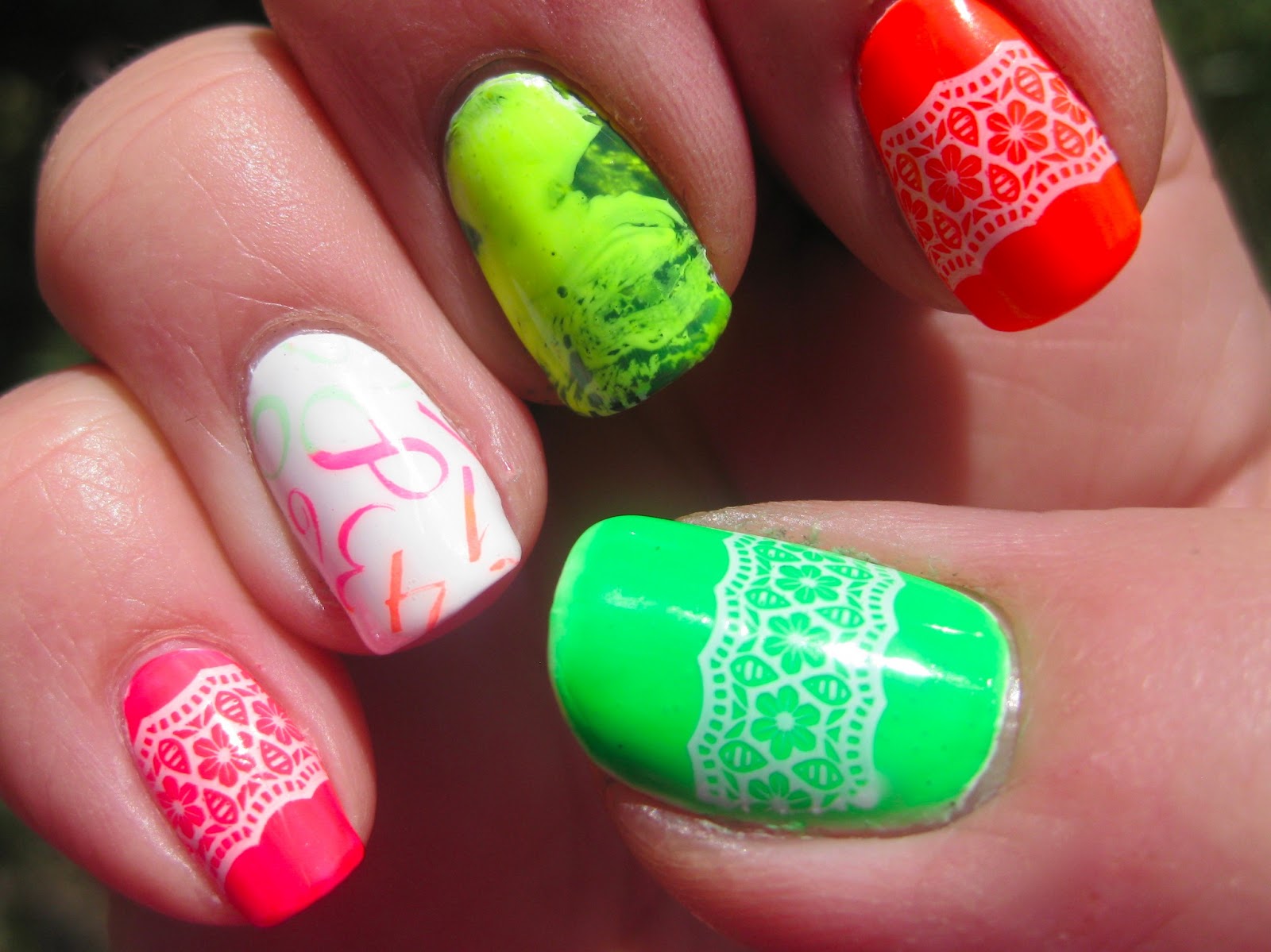
The polka dots were a pain. Kudos to every nail artist out there who can achieve perfectly same-sized dots with their dotting tools. I can't. No matter how carefully I work, I can't. But really, who in real life is going to look at my nails that closely? And I did get a couple compliments on these!


Tuesday, June 4, 2013

Eddie Munster nails?!?!

If there was ever a testament to the painful reality of my inadequate spacial relations skills, here it is:


WTH? Jenna, what is Eddie Munster's hair doing on your tips? Sigh... OK, so, in my head this would have had an effect similar to being under a black umbrella and seeing the rain falling just past it. Only, my inability to judge distance and size meant that the scallop-edged tape I cut with my decorative scissors and used for this funky French mani didn't translate to the realization that only about two scallops would fit on each nail, thus giving the illusion of hair slicked back from a creepily Dracula-esque widow's peak. (Whew! Major run-on there.)

Oh, but here's the kicker: there's even more humorous bungling hidden in the depths of this look! The base color was a franken I made before I learned that not ALL glitter is solvent-resistant. The original color of the polish was pale peachy-pink with turquoise, orange, pink, and gold hexes mixed in with iridescent micro glitter. Once it had finished mutating into a deadly muddy grey with glitters mere ghosts of their former selves, I just happened to name it "Bride of Frankenstein". Bwahahaha! What better polish mating could there be for a look that turned out to be so hilariously horrible?! Say it with me, people: "FAIL."


Flosser Stripe Mani

I fell in love with this idea from cutepolish at first sight! It doesn't have the texture of a candy floss/spun sugar mani, but it's so much easier and less time-consuming to do! I used three coats of OPI My Boyfriend Scales Walls as my base color, then painted Sinful Colors Aquamarine and Sally Hansen Insta-Dri Vigorous Violet directly onto a floss pick (not both at the same time, obviously). I also showed a little love to Sinful Colors Super Star on my trigger finger accent nails. I pretty much LOVE this look!


Friday, May 31, 2013

Galaxy in a Bottle

After about 5 months, I finally used my Kleancolor Chunky Holo Black as it was intended...as a topper for black polish! Such a spectacular effect for so little effort! Here it is over Sally Hansen Xtreme Wear Black Out. It seems almost like a galaxy effect in a bottle!


I think I've only used this amazing glitter topper one other time, here on top of purple. You can't even really tell that it's the same polish!

Anywho, this one was a lot of bang for my buck,  in terms of both cost and effort. And I couldn't stop sharing at that shift from green through yellow and orange to red!

Thursday, May 30, 2013

Cheery Daisy Mani

I saw Kelly's nails here at Set In Lacquer, and attempted my own version. My nails being much shorter, the flowers take up much more space. I really liked how hers just peeked at you from the tips and base of her nails, but this isn't too bad:


I used a franken I made from an L.A. Colors Color Craze polish; I'd jacked the color up a notch with a dribble of my China Glaze Japanese Koi and called the new color Cosmic Carrots.  I used a dotter to make the daisies with Sinful Colors Snow Me White and Sally Hansen Insta-Dri Lightening (rolls eyes at stupid spelling of polish name...). Very cheerful mani!

Thursday, May 23, 2013

Last, But Not Least––A Brushstroke Gradient

The last challenge for the Crumpet's New 31 Day/Slow Nail Art Challenge was "Recreate someone else's mani from earlier in the challenge." The Merge or Melt was the challenge I had the hardest time choosing a look for, so I Googled others' looks for that one and finally settled on a brushstroke gradient. I saw one somewhere done in blues and white with many little strokes from a small nail art detail brush, but I can't for the life of me find it now, so I went with a fan brush ala Superficially Colorful's beautiful rainbow nails. I stuck to a monochromatic theme for my nails, and did it vertically. I think this was better for my shorter nails as well as easier with my deep nail folds. It was still a bit of a booger to work with!


I started with two coats of Sally Hansen Xtreme Wear Lacey Lilac, then a couple of fan brush strokes of SH Insta-Dri Vigorous Violet, and finally a couple of Wet 'n' Wild MegaLast Disturbia. As you can see, my topcoat smeared the Vigorous Violet on my pinky. Oh well. This wasn't the most difficult nail art technique by far, but neither was it effortless for my lazy self! I think if I try it again, I'll go with the little strokes and a detail brush.

My Favorite Nail Art Technique

My chosen technique for the Crumpet's New 31 Day/Slow Nail Art Challenge is stamping. I'm not the swiftest at freehand, tape manis make me nervous (always waiting for half a nail's worth of polish to pull off with the tape...), glitter/jelly/crelly sandwiches by themselves are great when I don't have time for art...but stamping is easy, looks professional if done right, and with just two sets of stamp plates (Bundle Monster 2012 and Mash 26-50), I will never run out of color/design combinations!

For my stamping, I had a few goals: 1) Use pink––I have a lot of pink polishes, but hardly ever use them. 2) Use an untried––this polish is a franken I made called So Sari, a shimmery hot pink with loads of orange, hot pink, and gold glitters. 3) Use a polish I'd never stamped with before––I totally thought Sinful Colors Endless Blue was pigmented enough to hold its own as a stamping polish. I was sort of right; it shows up very well, but is slightly sheer so the base color here tinted it purple. Which was OK, as I was trying to decide between blue or purple stamping! 4) Use a stamp image I'd never tried before––I always think these bold geometrics are not my style, and end up loving the looks on my fingers! This is BM-305, by the way.

I was really happy with how these turned out!

Friday, May 17, 2013

New 31 Day Nail Art Challenge Photo Spam Post

So, our iMac died a painful death, and after two weeks, mi esposo finally got everything onto the MacBook Pro. I can't fathom devoting enough time all at once to getting caught up on posting the manis I've done for the challenge. So, here's what's been going on in Jenna-land for the past two weeks!

Merge or Melt: dripping ice cream cones!


Inspired by Fabric: This fabric was so loud! My nails were much more gaudy in RL, too. 


Inspired by Nature: crummy camera phone pic b/c I forgot to get a good one


Inspired by a Game: My 7-y-o requested Angry Birds. This was my first attempt at homemade polish decals. Not too bad!


Inspired by Your Childhood: I'm sorry, twee ickle girlies, but you were only a "child of the 80s" if you can actually remember the 80s!!  Spending the 2nd half of that decade learning to walk and talk does NOT count.  Here's a tribute to the popular neons, especially the electric-bright bobbie socks with lace on the edges!  (Can't believe I'm old enough to be seeing that trend come back...)


Inspired by Your Country: going down the toilet...


Inspired by You:  Got this idea from a piece of origami paper, a mottled greige and white background with stylized waves in mushroom brown. FYI, Sinful Colors Nirvana stamps like a dream.  Tada! (There isn't really a chunk missing from my thumbnail. No idea what trick of the light caused that...)


Inspired by Your Favorite Color:  My oldest helped me decide on this jelly sandwich, Sinful Colors Hottie, 2 coats with SillyLily Tequila Sunset in between. Oh gosh, I could not stop looking at these! They remind me of my kids' toys floating around in the pool on a sunny day!


Inspired by a Blogger:  One of the blogs I most enjoy and admire is Let Them Have Polish! Cristina is funny, friendly, honest, and soooo talented.  I've especially loved some of her manis with stamping over jelly or crelly sandwiches. This doesn't measure up (my pattern is too busy to show my frankened crelly -sammy really well) but I tried!

Whew! I'm caught up now!

Sunday, April 28, 2013

Texture, Schmexture

I am not a big fan of texture. At all. As in, alfalfa sprouts feel like hair in my mouth, and waffle-weave shirts give me hives. Literally. So, I was not so excited to see that Day 20 of The Crumpet's New 31 Day Nail Art Challenge was...texture.

I actually love the look of all those new textured polishes out there: Milani, and OPI, Zoya and Nails Inc...just not on my nails. I think I would go abso-frickin-lutely mad having to feel that on my nails. So, the closest I could bear to get was this:

I haven't used China Glaze Fly at all, I think, so it's the base color here, topped with one coat of Ninja Polish Floam. I matted it with NYC Matte Me Crazy; I should have gone for a second coat, because just one and the polish still has a bit of sheen. Sorry 'bout the tip wear; I'd had this on for two days before I remembered to take the pic.

After that, I used Sinful Colors Aquamarine for a perfectly-matched-to-the-glitter funky French mani, and after another day, was tired of the matte/glossy contrast look and added glossy topcoat to the whole shebang. Have pics somewhere; can't get to them because our iMac died! (sniff...) Waiting for hubby to get the new MacBook Pro up and running so I can find all the pics Eye-Fi has been hoarding for me, then I'll add them.

Monday, April 22, 2013

My favorite color?!? You gotta be kidding!

I was supposed to use my favorite polish for Day 19. Agh...too tough to chose! I decided to go with a new polish I got after falling in love with Stephanie's swatch of it at Imperfectly Painted: Sinful Colors Endless Blue. She's right in saying photos don't capture how deeply pigmented this polish is, although rather than cobalt, I might say this polish is something like electric royal blue.

At the same time I bought Endless Blue, I also picked up Hottie. Hate the name, but I've been waffling over buying the polish for quite a while. As royal blue is my favorite color in the whole amazing blue-to-blue-green range, I'd planned to just have Hottie over Endless Blue for this challenge. But I really felt the need for something more. So.

Here's my first horizontal gradient using Endless Blue and FingerPaints Tiffany Imposter, topped with the amazing and (in my case) under-utilized Social Suicide:


Something about this one reminded me of space, the sky, day-to-night science textbook diagrams...I love it and could not stop looking at this one on my fingers!

Friday, April 19, 2013

My oldest untried (AKA stop while you're ahead!)

Day 18: Your Oldest Untried

Seeing as I've been working my way through untrieds and seldom-used polishes through this whole challenge, and I've been finding beautiful swatches on other blogs of new polishes I can't afford and then frankening something similar, I had to really think about what was my oldest untried. I'm pretty sure it's a franken I made before I discovered that Born Pretty store glequins are NOT solvent-resistant. The polish is a black jelly with holographic and red micro glitters and what were supposed to be red glequins. Alas, before I even had time to come up with a cute name, the glequins bled, lending a reddish cast to the jelly (not bad—interesting, in fact!) and bleaching the glequins down to a peach shade.  I had been thinking how devilishly beautiful black and red can appear, and since this was not quite so intense and/or disastrous as the bleed could have been, I named it "It Could Be Worse."

I was careful with application, as those larger glitters could have proved fatal to a nice clean-up. I was surprised by the depth of the polish, and quite pleased. Alas, that's where it all went wrong. I really thought Kleancolor Metallic Red would be strong enough to show up against ICBW, but no. The full nail lips image I stamped using BM-303 isn't even recognizable on my nails. I ended up with it looking sort of like a Saran Wrap mani. OK, I thought, maybe a diagonal tape mani with a thick coat of Sally Hansen Xtreme Wear Red Carpet? Uh...no:
Definitely NOT enough contrast.

A close-up of all the glittery goodness beneath the sad screw-ups.  Smiley

I will definitely be using ICBW again, but with silver as a topper or just alone to show off the depth.

Thursday, April 18, 2013

My First Feather Mani

Challenge day 17 says "a new technique to you"...I'm far from a grammar expert, but wouldn't "a technique new to you" sound better? Hmmm.

Anywho, I decided to try a feather manicure. Thank you, my 10 sweet chickens, for dropping some really pretty feathers for Mom (me) to use! My base color here is a franken I call "The Rain Kept Falling in Love", because my oldest and I are sort of on a mission to name as many of my frankens as possible based on 77s songs. I followed The Nailasaurus' tutorial here for the real feathers, and then stamped the feather image from Mash 29 using Orly Buried Alive.


I think I liked my right hand the best! This technique was a lot easier than I thought it would be, and I was happy that the blue base contrasted with/complemented the feathers so well.

Saturday, April 13, 2013

Day 16 of the New 31 Day/Crumpet's Slow Challenge is color opposites. Lucky me, my two favorite colors are opposites!


That isn't a chip or bald spot on my thumb tip; maybe my nail was reflecting something? I used L'Oreal Notting Hill Blues, Sinful Colors Cloud 9, and my Born Pretty Store loose glitters.  This also could have stood in as Day 17's "new technique", as I hadn't really done a ton of hand-placing of glitter, but I decided not to cheat and did something separate for that one.  Smiley The glitter didn't take tooo long, about 30 minutes for both hands, probably would go faster if I wasn't such a newbie. This look was very sparkly and fun!

Wednesday, April 10, 2013

Watercolor Nails

I love participating in nail art challenges, albeit completely on my own. I get to try so many new techniques; day 15's challenge is watercolor nails!

Watercolor makes me think of...water, of course. And water, in this case, made me think of dragonflies:


Alas, I cannot remember AT ALL which polishes I used for the watercolor effect! I know both the green and blue were shimmer polishes, but that doesn't help much, since I have a TON of blues and greens! I know I used OPI My Boyfriend Scales Walls for the base, a waste of one of my more expensive polish purchases; I could have just used Snow Me White. And the dragonflies were applied using Sally Hansen Hard as Nails Black Heart, Kleancolor Metallic Orange, and a dotting tool. I was happy about the discovery of using a dotting tool for the wing shapes; I just dotted, and without lifting the tool, dragged toward the body of the dragonfly!

I ♥ Stamping!

Day 14's challenge was stamping...ooh, my favorite nail art technique! 


It's so hard to tell from the picture, but this was actually a jelly sandwich under the stamped vines. I used Pure Ice Free Spirit as my base color—not a jelly, but I wanted a firm foundation for the color! I added Sinful Colors Call You Later over that, and then added Nina Ultra Pro Pucker Up atop it. Pucker up is a neon duochrome sheer, so it's sort of jelly-ish in its translucence. I stamped with BM-312 and Konad Special Black. I loved how crisp the vine image came out!

Friday, April 5, 2013

Cheery Mani

Challenge Day 13 calls for a cheer-yourself-up mani. I've been itching to use both my Zoya Robyn and the spring images on BM-302. I couldn't decide between the bunny and the full-nail image of birds, snails and...what are those? "Suessian" trees? So I went with both in a skittle mani.


Obviously, Robyn is my base color, except for Kleancolor Metallic Fuchsia on my pinky. (It's much more metallic IRL, and so beautfiul!) I stamped with Konad Special White, and then used Sinful Colors Snow Me White, Sally Hansen Insta-Dri Lightening, and the fuchsia for the dots, stripes, and flower on the bunny nail. I couldn't figure out how to incorporate the accent/art colors into the full-nail stamp image, which is really the only thing I didn't like about this look.

Thursday, April 4, 2013

My first striping tape mani!

I've done a little taping here and there, but it always makes me nervous. Even after learning the trick of laying down a coat of quick-dry top coat to keep the base color from peeling up with the tape, I still get nervous! I bought a bucket-load of super-thin striping tape off eBay from some place in China about a year ago, and because I didn't know how to use it properly, it has languished in my nail art bin for too long! Now that it worked so well for masking, I might get brave enough to use it and leave it on...

Anywho, for the 12th challenge in The Crumpet's New 31 Day/Slow Challenge, my base color here is Sinful Colors Timbleberry/Thimbleberry. I'd love to know what the polish's real name is! I assume it's the former, since every bottle I've ever seen says "Timbleberry". But I have seen display cases with it spelled both ways...not all at once...you know what I mean! 

I laid down some striping tape in various designs, then sponged over my nails with a gradient of Timbleberry, Sinful Colors Hazard, and a pastel peach knock-off of Butter London's Kerfuffle that I call Kerfuffulous! (This is actually a name my son and I made up long ago for his alias during a silly tea party with his sisters!)

My skin is looking terribly dry here! Even with using lots of cuticle oil and body butter, my hands just stay dry. But at least I usually apply cuticle oil right before taking pics so it's disguised somewhat...

I liked this look better than I thought I would. I would like to improve my gradient technique, too, so that colors blend more seamlessly. Not sure how to accomplish that.

Thursday, March 28, 2013

Neon Splatter

I've only tried the splatter look a couple of times, because I'm not that great at blowing the polish out of the straw to get optimal placement and because cleanup is such a pain. But, this is what the 11th challenge calls for, so I decided to go for neon splatters, utilizing several polishes that have seen very little use or none at all.

 I wanted a white base that really contrasted with the neons, so I opted for Sinful Colors Snow Me White. My neons: pink—unnamed Sally Girl, orange—China Glaze Japanese Koi, yellow—Sinful Colors Neon Melon (what?!?!), green—Sinful Colors Irish Green, blue—Sinful Colors Aquamarine (not really neon, but so close and all I had), and violet—Sally Hansen Xtreme Wear Vibrant Violet.
As can be seen from my cuticles, I gave up after giving cleanup a good try. I really loved this look, although the look might be a bit young for me!

Monday, March 25, 2013

Frankening Fever

I've probably got upwards of 200 polishes now, which is a drop in the bucket compared to many of the well-known nail bloggers. And although I drool over every new permutation of every color in the spectrum, I know that there is neither room in my house nor time in my schedule to do justice to oodles of polishes.

What I've really been drawn to the last few months has been...INDIES! There are so many brilliant women out there creating unique and drop-your-jaw beautiful glitter bombs, bright holos, and jelly-sammies-in-a-bottle, but I just can't afford most of them.

I finally squirreled away enough allowance to get some suspension base, empty bottles, and a few solvent-resistant glitters from TKB Trading. Ever since, I've been frankening faster than I can use what I make! I don't have swatches/manis for these two polishes yet, but I was so excited about them!

The first was inspired by a mani I saw (cannot find it again anywhere—if it was yours, kudos!) with an orange/fuchsia/violet gradient stamped with silver paisley. Then I felt a compulsion to make a companion polish in cool colors to complement the warmth of the first. So, here they are: So Sari and I'm Sari, 2!


These are both jelly sandwich polishes, but the jellies are iridescent/duochromes. I'm in love with my own handiwork, I must say. (Insert sheepish grin.)

Friday, March 22, 2013

Geometric Nails

I was looking forward to Day 10: Geometric, because I tend to gravitate toward more organic shapes and don't utilize all the great techniques for creating geometric patterns on nails. I contemplated some form of tape mani, but since that's actually the next challenge and I haven't had much experience with tape manis, I went with some simple stamping. I've known since I brought OPI Ski Teal We Drop home from Hilton Head that I wanted to use it for this day's challenge, paired with silver squares/rectangles.

This past summer, my oldest showed avid interest in my nail art hobby just long enough to convince me to start her a small collection of polishes, whereupon she gave up quickly and I inherited her teeny stash. This was my first time using Wet 'n' Wild FastDry Silvivor from that stash; I could tell from the bottle it was more glittery than my solidly chrome Sally Hansen Insta-Dri Silver Sweep. When I stamped with it, the result came across as more grainy looking than Silver Sweep; not necessarily a bad thing, just different.


The deep teal of STWD was difficult to capture with my camera, but I think these shots pretty accurately show it. I really like it paired with the jumbled rectangles and squares of BM-320. I must have ginormous thumbnail beds, though, because you can see below that the full nail images don't quite reach the edges of my thumbnails. Still and all, I'm in love with stamping and the not-quite-complete thumb stamping is only really obvious when I slap a macro shot on here!

Thursday, March 21, 2013

St. Patrick's Day Nails

Yeah, yeah, everybody else showed off their St. Paddy's looks before the 17th. My manis always get posted days and days after they're on my fingers. There you have it.

Day 9 called for a saran wrap mani. I've had about a 50% success rate with this technique, apparently due to the fact that what is in my head doesn't always translate well into real life. As was the case with this one, of course...

I started with Petites Lime Freeze as my base color. I can't decide what I think of this polish. Far from being lime, the color is such a delicate, shimmery celery green, but it's too sheer for my taste. It wasn't going to matter much here, though. I covered it with a layer of a homemade franken (Verdigris) and then "saran wrapped" it off. So far, so good: good contrast, same color family.

Here is where my RL mani began to deviate from my imagined one. I really wanted to attempt some freehand shamrocks, and I really wanted to stick with the challenge, and I really thought Kleancolor Metallic green would show up against the mottled background. Uh, so much for reality. Let's just say it didn't; let's just say it looked like a leprechaun had pooped on the grass.Green Smilies

 Time to salvage this mani! I ended up doing another layer of saran-wrapping with the Kleancolor, which pretty much hid Verdigris, but I didn't care anymore. I decided to top it with a coat of Sinful Colors Call You Later, a great green and gold glitter topper. Final result:

My fingers look ridiculously red here. Not true to life, not even the way they looked on the computer I used to edit. Whatever.

Close-up of right thumb to see the saran wrapping and glitter a bit better.

In the sun. Man, oh man, is that Kleancolor Metallic Green bright!

I left the look alone for 24 hours, then jacked it up with some black flames from Mash-48, chosen by my elf of an almost-seven-year-old. Pic is blurry because I couldn't be bothered to wait until morning to get an outdoor shot. (If nothing else, I stand a chance of getting some award for Laziest Nail Blogger with the Crappiest Photos!)

Duochromes, Flakies, and Holos...Oh My!

Day 8 of the Slow Challenge was Duochrome, Flakie, or Holo. I managed to get an unused franken, a duochrome, and a flakie all in! Adding a holo topcoat was a thought, but there is such a thing as too much bling!

I started with basecoat and two coats of Vintage Rose, a franken I made from goodness only knows what. I added one coat of Sinful Colors You Just Wait, which changes from sheerest peach to gold to pale green depending on the angle/lighting. Then a coat of China Glaze Luxe and Lush flakie and three coats of topcoat. Even then I had a few flakies that kept wanting to snag at the sides of my nails.

 These were so difficult to capture! I noticed the duochrome changed the color of Vintage Rose from a very deep rose to more of a dark terra cotta. The pic above is the peachy tone, below is the gold.

I ended up having to move indoors (and most of the time I can't be bothered with trying to photograph my nails in indoor light) to catch the shift to green.

I did end up adding a holo topcoat the day before I took these, but since I'm fairy useless at those amazing photos of holos that other people get, it wasn't worth it to get a pic. I really enjoyed these!