Friday, February 22, 2013

I will survive having gold nails!

Ah, no, I'm not a big fan of gold. Not in jewelry, not on my fingers. For Day 3: Gold, I was tempted to pick a fave color base and use gold as the stamping polish or glitter or whatnot, but in the spirit of sticking to untrieds/frankens/hardly used polishes, I decided to go for a base of China Glaze Rare & Radient. I get the flashes of green in this duochrome, but I mostly see the old gold color. I discovered two things about this polish: 1) It applies SO much better than Maybelline Color Show Bold Gold (which drags big time), and 2) other bloggers are not kidding when they say it's "brushstrokey". I need to remember that for future wear, because I will definitely try wrapping my tips BEFORE I paint each nail, rather than after, because the blackish undertone of this polish seems to make the wrapping of my nail tips show up glaringly. (The dark spot on my pinky is just a shadow.)
I stamped the rose full-nail image from BM-323 with Nina Ultra Pro Brandywine. God alone knows how old this polish is! I've had it for about 5 years; it came in a cardboard box full of polishes my hubby's aunt bought off someone at the flea market! Works like a dream, though it's so old and I hardly ever use it.

I'm keeping these dadgum gold nails on for three whole days! Two is about the max I can stand for colors/manis I don't particularly like, but if I hold off until tomorrow night to redo, I'll have a nice, fresh mani for church on Sunday.


Glitter Tips

Day 2 of Crumpet's Slow Challenge is silver. I am partial to silver rather than gold. I don't think I've ever tried a glitter tip gradient, and that is what I chose for this day. I started with a base of NYC In a New York Minute Sidewalkers, a light-to-medium grey polish that, to my eyes at least, leans just a teeny bit brown, or maybe it's greenish. Hmmm... I don't use grey polish very often, and I'm never that excited about it...until I put it on! I really like the subtlety of it, although I don't think grey would be a great color for me in, say, clothing.
There are two ways to do a glitter gradient, I think: sponging, or applying three layers of polish. I chose the latter. I used my unnamed silver glitter polish to apply a thin coat from about halfway up my nail down to the tip. When dry, I added a second coat over about 2/3 of that area, then again 1/3 of the way up. This was so simple, and yet so elegant! I love the way the glitter caught the light w/o outshining the base color.


Tuesday, February 19, 2013

DIY Chalk Paint (I Think I'm in Love)

I've been pondering redecorating the master bedroom. While researching how this lazy woman can easily and cheaply repaint a 30-year-old dresser and bureau, I stumbled across several blogs referencing Annie Sloan Chalk Paint. Apparently this stuff is miraculous...and crazy-expensive! As in, one quart of this stuff costs what I'd spend on a gallon of paint at Lowes. Nuh-uh. Not gonna happen. Knowing that all good things (and a God-awful amount of bad) are on the 'net, I Googled "DIY Annie Sloan chalk paint". And found this amazing post where she gives the recipe, comparisons, and wonderful pictures!

I went ahead and chose my accent colors so I could test this stuff on something small. A little background: our bedroom has been in shades of blue and maroon/burgundy for about...um...thirteen years?!? Time for a change, dangit! There's no money for repainting the whole room, I would not subject my hubby to that arduous task at this point, and I do love the just-barely-too-blue-to-be-periwinkle color he picked out six years ago. So, blue it is, dings and all. (I'm afraid touch-ups would be glaringly obvious.) I decided to go with painting the light oak furniture cream and antiquing it to match a gorgeous, enormous trunk some friends just gave us. Accents on the trunk are sage green, so I'm going with that and a spicy pumpkin pie orange. I found $3 sample jars at Lowes and went with Gold Infusion (it's green, though), Gaslight, and a box of plaster of Paris, the cheaper of the two options for DIY chalk paint, the other being non-sanded grout.

First to be tested with the DIY chalk paint was a jewelry box I inherited when my daughter got tired of it (and she inherited it from my sis-in-law!). I'm not a big fan of red-toned wood to start with, my dear daughter had beaten this thing up pretty badly, and it didn't match anything else in the room. Its one redeeming quality was that by ripping out a lazy-Susan-style necklace hanger, I could store my small stash of jewelry AND all my homemade, essential oil perfumes, balms, body butters, etc. in one place, significantly de-cluttering my dresser top and making my dusting slave (a.k.a. my son) very happy.

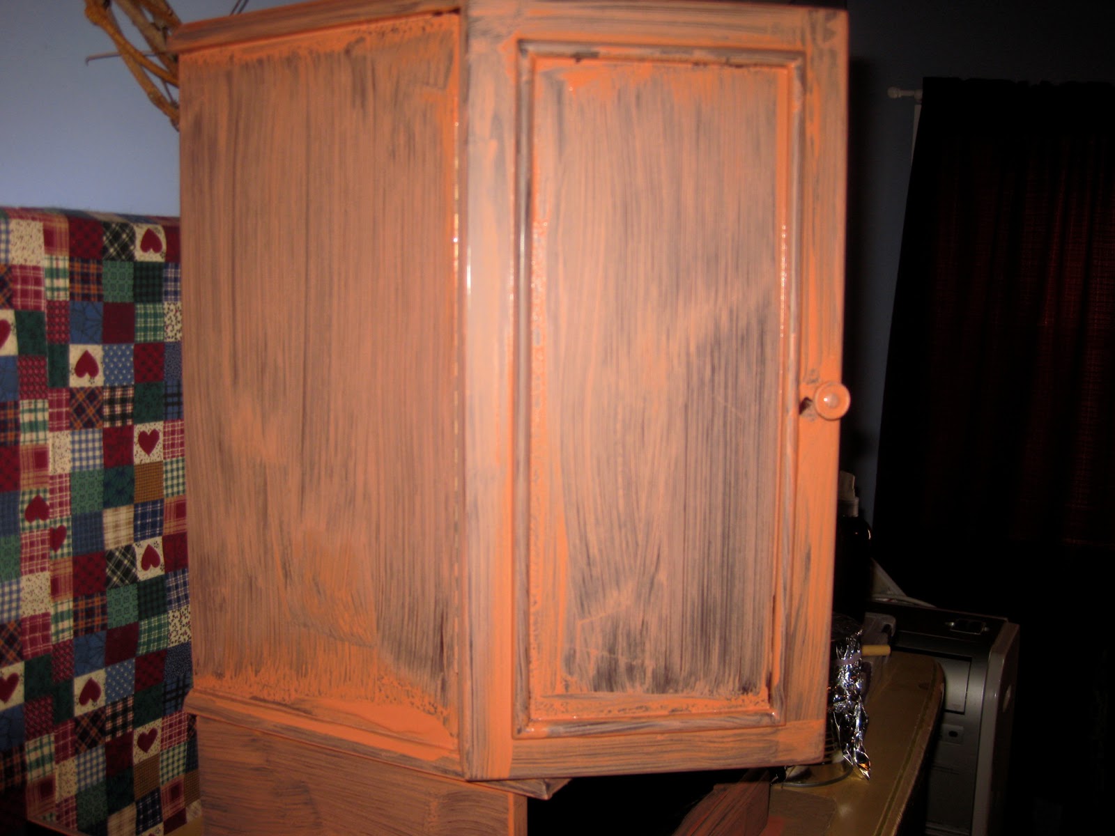
I read the instructions wrongly, making the paint a bit thinner than I think it should have been. This first coat made me nervous.

Somehow I misplaced the second-coat pic, so here is the third and final coat. Good coverage at this point, looking forward to jacking up the green sample and getting full coverage at two coats!

I sanded the pieces to smooth the grittiness (which wasn't bad to start with) and distress the edges, then waxed and rubbed, rubbed and waxed with homemade beeswax furniture polish. As much as I love the idea of non-petroleum furniture polish, I think to get a longer-lasting patina I'll have to go with shoe polish—the cheap version of Annie Sloan soft wax or even Minwax Paste Finishing Wax, simply because I have neutral shoe polish on hand.

I'm so excited by how easy and beautiful this is! I can't wait to tackle the big pieces of furniture!

Black and White and Beautiful All Over

I started a new challenge right away, solo and at my own pace, of course. I thought about a break between challenges, but I think the "rules" help me to branch out from using just my favorite colors all the time. I'm trying to go through this challenge using all untrieds or polishes I've previously only used for nail art or on one nail for a skittle.

The first day is Black and White. I love black polish on my nails; I think it looks elegant rather than goth, especially as a backdrop for some nail art. I've seen all sorts of beautiful art done with the paisley image from BM-315 and have been looking for the perfect opportunity to use it. So, here it is:

I was a little frustrated to see that I didn't aim right on my left thumb; Bundle Monster 2012 full-nail images just barely cover my wide thumbnails when I do get it lined up perfectly. Other than that, I was pretty happy with this. My base colors are Sally Hansen Hard as Nails Black Heart and my one and only OPI, My Boyfriend Scales Walls, which is thin and streaky, but well worth 3 coats because of its tendency to look white without being glaring. I stamped with Konad's black and white stamping polishes. I thought this design was eye-catching yet not obnoxious!

Saturday, February 16, 2013

Open to Interpretation (aka Easter Puke Nails)

The last day of the 31 Day Nail Art Challenge!  Granted, it took me something like four months to complete, with side jaunts and rest breaks along the way. Nevertheless...

Day 31 of the challenge as listed here says, "Re-create your favorite challenge." What does that mean? Redo exactly my favorite that I did, that someone else did, re-create my fave of my own but do it a little differently...?!?! Googling around, I discovered that some versions of the challenge list day 31 as, "Re-creat someone else's mani that you love." Ah...that's better.

This is the beautiful mani I picked, although I wanted to do it in different colors. I wanted to use Orly Buried Alive as my base. I was surprised by how much I loved this color on my fingers! Alas, that was the last thing that went well.  The stems I painted were too thick and my choice of flower/bud colors did not pop against the base color. I have no idea how the ones in my" inspired by" stand out so well on that navy blue. I ended up mixing each of mine with white, which looked just muted until they were up against that brown, whereupon they took on Easter egg hues. The horror continues! The dots were too big and too crowded, and then...THEN! I noticed my stark white stems had turned cream-colored. "OK," I said, "I can live with cream." As I continued to stare at my completed mani over the next 30 minutes, I watched that cream turn to a banana yellow. Not a bad color in and of itself, but the look as a whole was just, well, icky. Like someone vomited their Easter candy onto my fingernails. I left it on just long enough to prove its awfulness here:

Then I said, "The challenge is over. I'm going to do whatever I want on my nails, " and proceeded to spend more time than I could afford on a Friday morning doing these:

Pizza nails! Per my son's request, so even that wasn't really doing what I want. But it's better than Easter puke. Just sayin'.

Friday, February 15, 2013

Imitation is the Most Sincere Form of Flattery

Or so they say. For "Inspired by a Tutorial" on Day 30, I chose to attempt the spun sugar look I watched xoxoalexisleigh demonstrate here. I combined this with some Valentine pink hearts, saving the spun sugar for my accent nails becausedang!—it takes F-O-R-E-V-E-R. Looking  back on it, I wish I'd used a second pink rather than the blue; I picked blue because I was originally going to use a frankened jelly-sammy-in-a-bottle for the other nails that contained some blue glitter. Oh well.

My hands look terrible here! That is not actually skads of dry skin clamoring for hand cream; I'd just finished waxing a piece of furniture that I'd painted with DIY chalk paint (this blog has terrific instructions and loads of info on a fabulous technique!) and the wax dried on my hands. I didn't even realize it until I looked at the pic...after I'd taken this polish off and couldn't get a better pic, of course.

My base color is a franken my youngest asked for and named, a bubblegum pink creme with teeny holo glitter called Pink Ocean. (She's precious, but corny.) I stamped over it with China Glaze Fly and BM-317. My accent nail is a beautiful, squishy, unnamed raspberry red jelly from Donna Michelle I scooped up at the dollar store. (I bought it to franken with, but I'm kind of in love with it the way it is.) The strings of polish atop it are Fingerpaints My Art Belongs to You, Sinful Colors Snow Me White, and Pure Ice Calypso. As fun as this look is, just doing both my ring fingers was a pain in the tukhus! Stir, stir, stir, stir, stir. Stretch, stretch...you get it. Too little bang for my buck, effort-wise. So, if I EVER feel like wasting that much time for that little result, it will still be accents only!

Fairies on my fingers...

Day 29's challenge was "Inspired by the Supernatural". I am NOT AT ALL into creepy supernatural stuff, so I was leaning towards doing something that reflects my faith in Christ. But I could not think of anything at my skill level that would classily depict that. I went with something cute and sort of silly: fairies. This mani wasn't all that fabulous, mostly because it didn't show up that well on the black background.

I started with a base of Sally Hansen Xtreme Wear Black Out, the most miserable, thin, streaky black creme I've ever owned, so I had to use two coats. I topped it with a coat of Wet 'n' Wild Fast Dry Hannah Pinktana and pressed a few holo silver hexes from the dollar store into it. I stamped a flower in Kleancolor Metallic Purple and a butterfly (just half the image on my ring finger) in Kleancolor Metallic Fuchsia from whatever Salon Express plate (can't be bothered to go look). I painted a head, arms and legs in Nakey Nana (a homemade franken named for my littlest's beautiful skin), a dress in Color Club Worth the Risque, and hair with Kleancolor Metallic Yellow.

Pardon the carpal tunnel wrist brace. Couldn't be bothered to take it off!

Awkward angle of my ring finger, trying to show the edge of the flower and the side view fairy w/o too much glare!

Back view of a fairy reaching to touch a flower. This shot almost totally disguises the flower, but it does extend to the right side!

Not my best ever, for sure.

Irish Nails!

Yet another challenge I was a bit stumped by was Day 28: Inspired by a Flag. I'm not a patriotic person, and the American flag seemed too complex for my skills, anyway. I got to thinking about my Irish heritage (among all the other things I'm a mix of), and the fact that my oldest daughter is completely enamored of everything to do with Ireland. So, I picked the Irish flag, a fairly simple one that is nice and bright:


I gave all my nails a coat of Sinful Colors Snow Me White, as three of my nails would have white, and the other two colors I chose are rather sheer.  I topped the white ones with Finger Paints Well-Cultured Pearl, my index with Sinful Colors San Francisco, and my ring finger with Pure Ice Hot Tamale (I find myself falling back on that particular orange quite a bit!). For my thumb, I pulled apart some Born Pretty dried flowers and rearranging them to look like four-leaf clovers. And in honor of the legend about St. Patrick chasing all the snakes from Ireland, I stamped the snake image from Mash-50 with my frankened green stamping polish and then carefully painted the universal symbol for "no" or "forbidden" or whatever in black. Pretty cute, I think.

Brushstroke Art

Holy Moses on a motorbike!! I am so far behind; I've got about two weeks' worth of finger(nail)painting to document. Agh!

I was totally intimidated by Day 27: Inspired by Artwork at first. All these gorgeous posts of nails painted like Starry Night and The Scream... but I took my cue from a few others who, like me, must have felt that something more abstract and open to interpretation would be the answer.

Here is what I picked out when I Googled "artwork":

artist: Michel Saloff-Coste

 These were pretty easy to do, and the bonus was that I worked in yellow as my base color. Yellow is my least favorite color, and I like to challenge myself to use it.

Even with something as easily interpreted as abstract art, I still found myself a bit unsatisfied with my final result, but my hubby and kids really liked this one.
This was my first attempt at a brushstroke mani. Sometime I'd like to try a monochromatic one.

Saturday, February 9, 2013

Inspired by a Pattern


My first thought when I saw "inspired by a pattern" for Day 26 was some sort of clothing pattern: floral, plaid, stripes, polka dots, houndstooth check, ... But when I Googled "pattern", this image popped out at me:


Oh, I love it. Nothing too original, but this green is beautiful! Not too hunter-ish, not too emerald, and I love the swirls peeping out from behind the snowflakes. And here in SC, man, do I wish we got more snow!

I don't have this green in my arsenal; the closest thing I had was Sinful Colors Rise and Shine. The label on the bottom says matte, but to me it seems to dry looking a bit like all those spiffy rubber finish polishes I've seen on blogs. The closest I could get for the swirls was to stamp Mash-40 with a shimmer over that rubbery goodness, as I was not in a million years going to keep mixing little dots of Rise and Shine with just a touch of black to get a darker green. I used another Sinful Colors polish, Gorgeous. Oh man, I was tempted to stop there with the swirls. I've never done a tonal stamping mani before, and it was so elegant. But, further up and further in! I stamped with BM-323 and (yet another) Sinful Colors Snow Me White.

I had a hard time capturing the swirls. I can see one glinting on my thumb and the darker effect I was looking for on the other fingers in the first pic, and all shimmering a bit behind the flakes in the second pic. Not too bad for someone who is determined NOT to buy a new polish every time I don't have the exact color in my stash.

Tuesday, February 5, 2013

Fashionab-owl!

Day 25: Inspired by Fashion had me stumped for a bit. I have NEVER had a clue about what's fashionable, and have never cared, either. I Googled "fashion"...and laughed my head off at all the images! Seriously?!?! Someone actually wears those things?

But I do have a least a little bit of an idea what's fashionable in the nail art world. And what seems to be cutesy fashionable on Pinterest. And two of those things are half-moon manis and owls! I saw the gorgeous little owls on Let Them Have Polish, and felt that was fashionable enough for me!

I started with base coat and a coat of Orly French Manicure Deja Vu to brighten my stained nails a bit. I found a rainbow/gradient-ish group of polishes that all had a similar shimmer finish; I was in the mood for cohesiveness! (Is that a word?) From pinky to thumb, I used Sinful Colors Rise and Shine, Pure Ice Free Spirit, SC Cloud 9, Pure Ice Hot Tamale, and SC Under 18. All the little tummies are just the owls' colors mixed with white, the beaks are Orly Buried Alive, and the eyes are Sally Hansen Insta-Dri Lightening (why?!) and SH Hard as Nails Black Heart.

Another mani I'm thoroughly enjoying looking at!

Swirly Goodness!

I was looking to use colors I don't wear much for this mani, and I'm not a big fan of pink or yellow. I didn't want to rob these colors of their rightful share of well-planned time in the spotlight Smiley, so I spent some time contemplating what to do with two colors I don't like much. This turned out to be fun, and easy, and all that I imagined in my head! Sinful Colors Jamboree, topped with a coat of Kleancolor Metallic Yellow that I then "Saran-wrapped" off to get a cool splotchy effect. When dry, I stamped the swirls from Mash-40 with Konad Special Black. My accent nail is Sally Hansen Hard as Nails Black Heart topped with Kleancolor Chunky Holo Black. Another mani I could not stop staring at! The pic is hurry-blurry, and you can see edge wear because I'd had it on for two days before I remembered to take a pic, but I think the swirly goodness is still obvious!